
Hello and welcome to ExamPundit. Here is another Set of Data Interpretation containing Graph Chart and Table Data.
Direction (Q. 1-5):
The following graph
shows the export and Import (in lacs) of Company P through 2011-15:
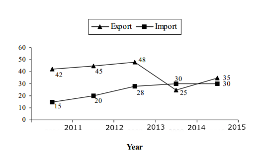
Ratio of Export and
Import of Company P and Q (P : Q) through these years is as follows:
|
Year
|
Export(P:Q)
|
Import(P:Q)
|
|
2011
|
3:5
|
3:7
|
|
2012
|
3:4
|
4:9
|
|
2013
|
4:7
|
7:10
|
|
2014
|
5:8
|
6:5
|
|
2015
|
7:9
|
3:8
|
1. Export of 'Q' in 2011.
Is how much percentage more or less than export of P in 2011?
(a) 60.34%
(b) 64.66%
(c) 66.66%
(d) 67.85%
(e) 70%
2. Average import of
'Q' is how much percentage more or less than average export of 'Q'?
(a) 26.9% more
(b) 34.2% less
(c) 24.7% less
(d) 22.7% more
(e) Both are equal
3. What is the
difference between total import of company Q and total export of Company P?
(a) 32 units
(b) 30 units
(c) 28 units
(d) 40 units
(e) 25 units
4. What is the
difference between export of Q in 2014 and import of P in 2013?
(a) 10 units
(b) 11 units
(c) 12 units
(d) 13 units
(e) 9 units
5. Import of Q in 2013
is how much percentage more or less then the export of 'P' in 2014?
(a) 50%
(b) 40%
(c) 70%
(d) 65%
(e) 60%
Solutions:
|
Year
|
Export
|
Import
|
|
2011
|
70
|
35
|
|
2012
|
60
|
45
|
|
2013
|
84
|
40
|
|
2014
|
40
|
25
|
|
2015
|
45
|
80
|
Regards
Team ExamPundit
Books For 2015 Banking/Insurance Exams